research
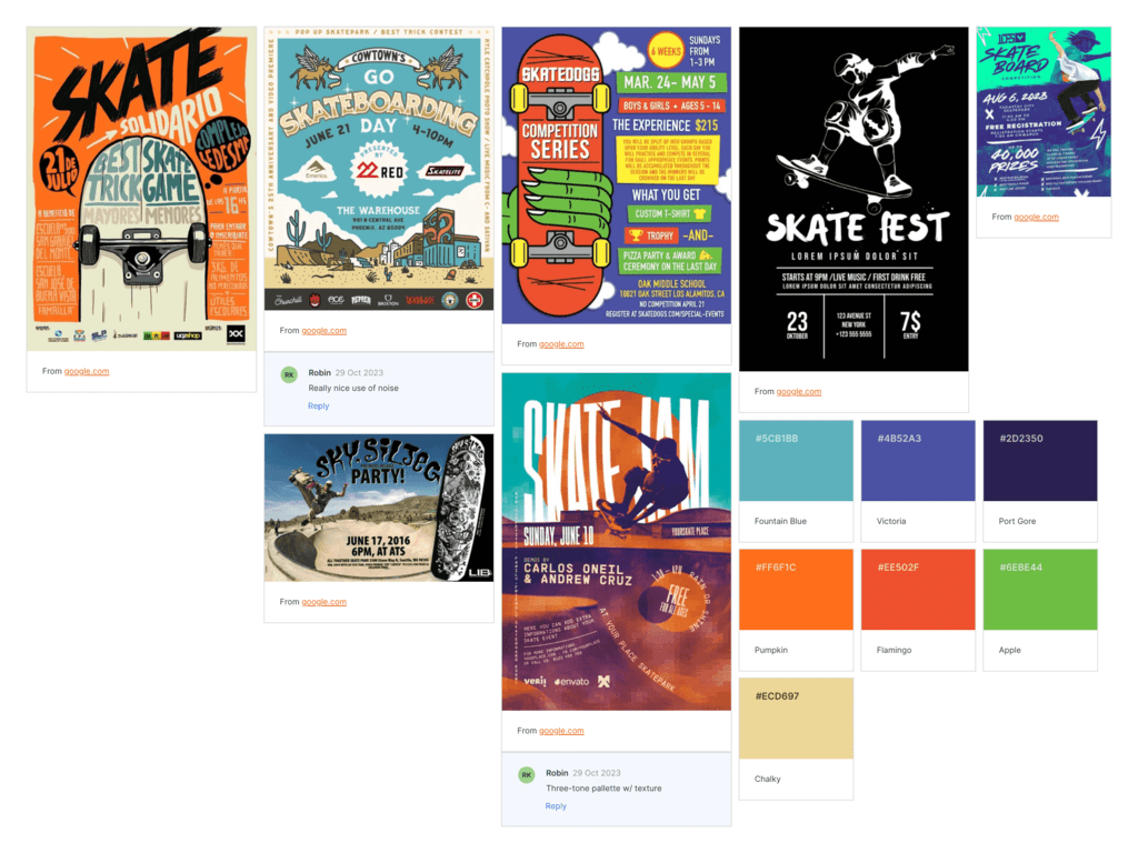
The first stage of my design process was researching pre-existing posters for skateboard-themed events, as shown in the moodboard to the left.
I took the time to study the overall themes present in the posters and select some of the colours and fonts I considered most striking. In general, I found bold, complementary colours, vector artwork and decorative, chalk-like text were common among the designs I found, giving the posters an energetic, yet carefree aesthetic.
references
Images featured in the moodboard:
- Cowtown Skateboards (2022) GO SKATEBOARDING DAY 2022! [digital art]. At: Cowtown Skateboards [online]. Available from: https://www.cowtownskateboards.com/blog_detail.cfm?blogId=3056 [Accessed 11 December 2023].
- HIGH FLYER (2023) Skate Event sa Tagaytay [digital art]. At: Facebook [online]. Available from: https://www.facebook.com/photo.php?fbid=610993831141787&id=100066935265110&set=a.604949478412889 [Accessed 11 December 2023].
- K, S. (no date) Skate Event Flyer Template [digital art]. At: PosterMyWall [online]. Available from: https://www.postermywall.com/index.php/art/template/397dfa0601dbcfa86378519627a47ed8/skate-event-flyer-template-design [Accessed 11 December 2023].
- Lascu, M. (2018) Skate Contest Flyer & Social Templates [digital art]. At: Behance [online]. Available from: https://www.behance.net/gallery/62342927/Skate-Contest-Flyer-Social-Templates [Accessed 11 December 2023].
- Lib Tech (2016) event-poster-sky-pro-party [digital art]. At: Lib Tech [online]. Available from: https://www.lib-tech.com/blog/2016/06/14/come-skate-celebrate-friday-61716-together-skatepark/event-poster-sky-pro-party/ [Accessed 11 December 2023].
- Orell, M. (2014) DOC Skatepark Posters [digital art]. At: Behance [online]. Available from: https://www.behance.net/gallery/13510631/DOC-Skatepark-Posters [Accessed 11 December 2023].
- Skatedogs (no date) Skatedogs Competition Series [digital art]. At: Skatedogs [online]. Available from: https://www.skatedogs.com/special-events/ [Accessed 11 December 2023].
